Kristin Standiford
Microsoft 365 Compare page
Optimization through research and testing
Role: Lead UX DesignerTeam: Product, Marketing, ExperimentationPlatforms: Microsoft.com
Impact: 19.3% increase in M365 Personal subscriptions.

19.3%
SummaryThis project demonstrates how I challenged a risk-averse status quo by validating user problems through research and leading a data-informed redesign that improved subscription conversions.
Background and context
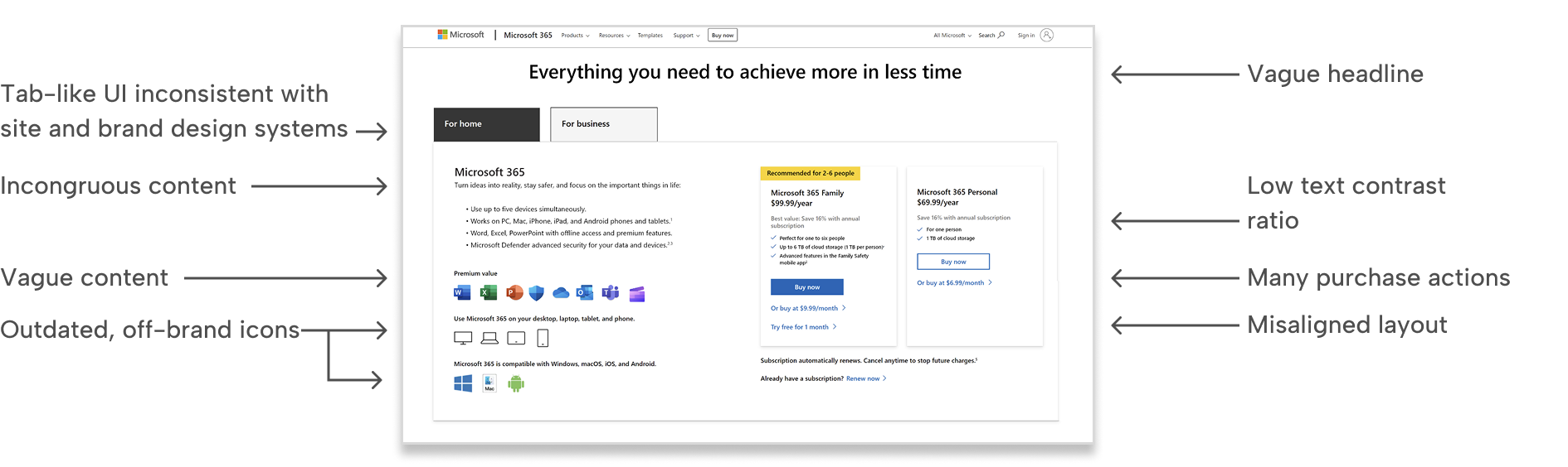
The Microsoft Store team inherited a legacy Microsoft 365 subscription comparison page that was outdated, inconsistent with the store and brand design systems, and filled with fragmented content such as vague feature descriptions.
Since the page did generate revenue, stakeholders were hesitant to make meaningful updates due to the risk of negatively impacting subscriptions.
Seeing an opportunity to improve the experience, I took the initiative to audit the page and validate whether its structure was hindering subscription decision-making.
Challenge
Sentiment around the page was highly risk-averse. The live site experimentation team favored small incremental optimizations designed to minimize risk, defining success as “no harm done.”
While well intentioned, this approach often produced a fragmented experience and disjointed design changes.
I believed this could gradually erode user trust and undermine the integrity of the Microsoft Store experience.
Immediately I identified several UI, content, and accessibility issues.
Research
To validate the problem, I independently ran surveys on UserTesting.com and analyzed live site analytics.
User feedback consistently indicated that people didn’t know where to look first. Their attention scattered across the page as they tried to understand the differences between subscription plans.
Analytics supported this finding, revealing high abandonment rates.
I investigated the root cause. Rather than guiding users toward a clear decision, the page structure was disorganized and introduced unnecessary complexity.
Below is a breakdown of the problematic structure and content order.
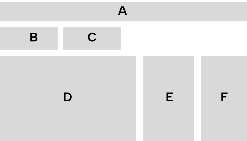
A: Page headlineB: Active Consumer tabC: Inactive Business tabD: ContentE: M365 Family module (yearly, monthly, trial buttons)F: M365 Personal module (yearly and monthly buttons)
Ideation and solution
I stepped back and reframed the core purpose of the page.
This experience was not meant to be a marketing destination. It was a comparison and decision tool.
The page needed to:
- Help users select a Microsoft 365 Family or Personal subscription
- Allow users to choose yearly or monthly billing
- Redirect business users to the appropriate business plans
- Offer a free trial option for users not ready to commit
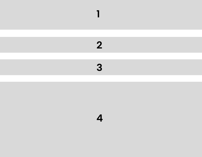
With this goal in mind, I restructured the content hierarchy to:
- Ground users with a clear headline
- Surface navigation to the business plan page
- Enable simple toggling between yearly and monthly pricing
- Present a scannable side-by-side comparison with clear calls to action
A more graceful layout
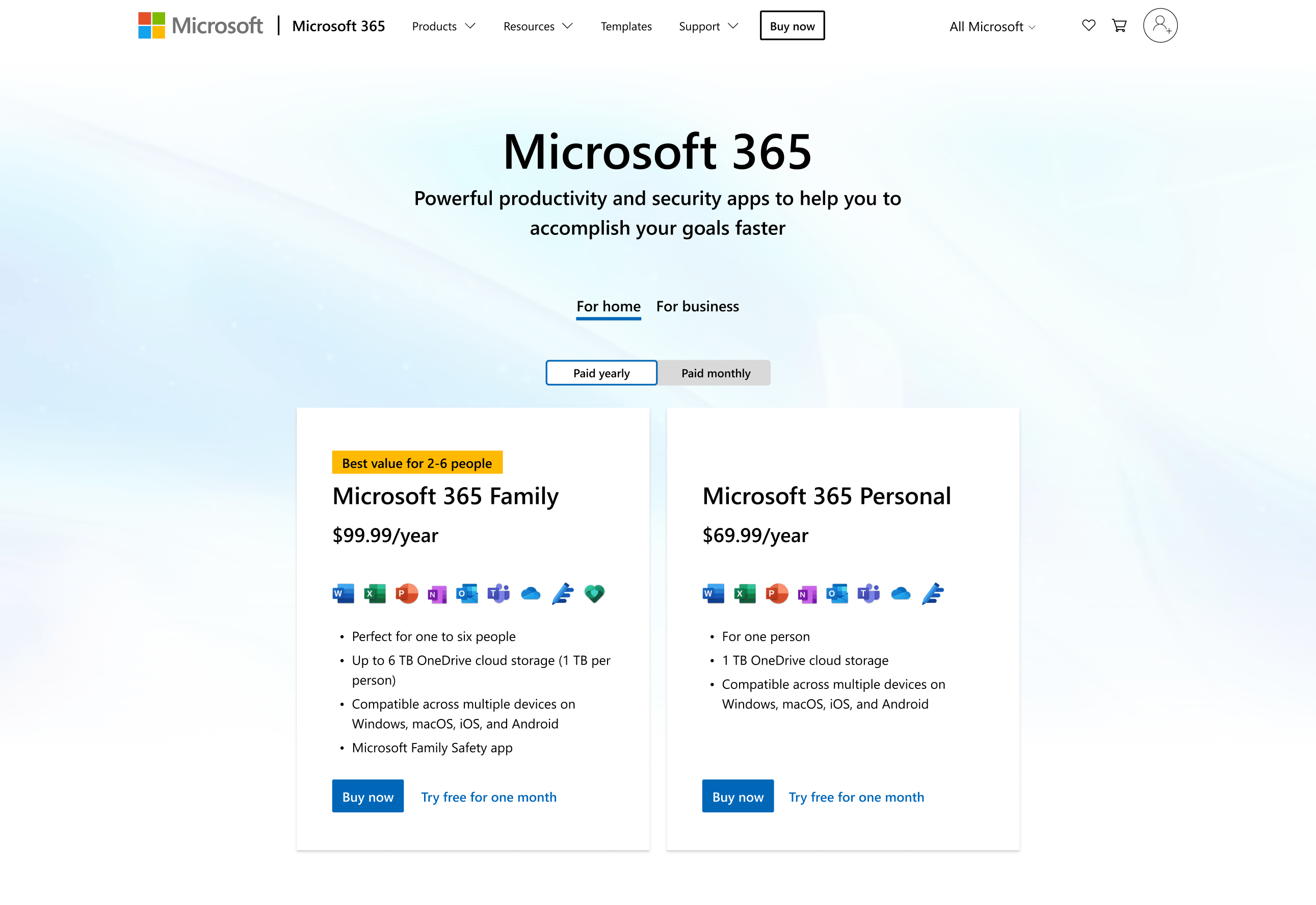
I designed a layout aligned with the Microsoft Store design system while honoring Microsoft 365 and Fluent design principles.
Using the framework I defined, I created a more clear and scannable comparison layout.
I then began socializing the design with store stakeholders and the experimentation team to build alignment around testing the redesigned experience.
Results
Due to stakeholder caution, the redesign initially received limited experiment traffic.
Even with constrained exposure, results were strong.
Once the experiment reached a 50/50 traffic split, the redesigned experience showed a 19.3% increase in Microsoft 365 Personal subscriptions.
Leadership’s response was immediate:
“Why don’t you just build and launch this as the new product of record?”
Lasting impact
Following the successful experiment, leadership approved the redesign as the new product of record.
I partnered closely with engineering to ensure the new experience was responsive, accessible, and aligned with the Microsoft Store design system.
Key takeaways
Lead stakeholders toward meaningful change
Stakeholders were initially hesitant to modify a page that generated revenue. By validating the problem through user research and live site analytics, I built the confidence needed to test a more substantial redesign rather than rely on incremental optimizations.
Redesign experiences holistically, not as isolated elements
Previous tests focused on optimizing individual components, which resulted in a disjointed overall experience. By stepping back and restructuring the information hierarchy, I unified fragmented content into a cohesive comparison experience that significantly improved subscription conversion.
Return to all projects →
Kristin Standiford
Microsoft 365 Compare page
Optimization through research and testing
Role: Lead UX DesignerTeam: Product, Marketing, ExperimentationPlatforms: Microsoft.com
Impact: 19.3% increase in M365 Personal subscriptions.
19.3%
SummaryThis project demonstrates how I challenged a risk-averse status quo by validating user problems through research and leading a data-informed redesign that improved subscription conversions.
Background and context
The Microsoft Store team inherited a legacy Microsoft 365 subscription comparison page that was outdated, inconsistent with the store and brand design systems, and filled with fragmented content such as vague feature descriptions.
Since the page did generate revenue, stakeholders were hesitant to make meaningful updates due to the risk of negatively impacting subscriptions.
Seeing an opportunity to improve the experience, I took the initiative to audit the page and validate whether its structure was hindering subscription decision-making.
Challenge
Sentiment around the page was highly risk-averse. The live site experimentation team favored small incremental optimizations designed to minimize risk, defining success as “no harm done.”
While well intentioned, this approach often produced a fragmented experience and disjointed design changes.
I believed this could gradually erode user trust and undermine the integrity of the Microsoft Store experience.
Immediately I identified several UI, content, and accessibility issues.
Research
To validate the problem, I independently ran surveys on UserTesting.com and analyzed live site analytics.
User feedback consistently indicated that people didn’t know where to look first. Their attention scattered across the page as they tried to understand the differences between subscription plans.
Analytics supported this finding, revealing high abandonment rates.
I investigated the root cause. Rather than guiding users toward a clear decision, the page structure was disorganized and introduced unnecessary complexity.
Below is a breakdown of the problematic structure and content order.
A: Page headlineB: Active Consumer tabC: Inactive Business tabD: ContentE: M365 Family module (yearly, monthly, trial buttons)F: M365 Personal module (yearly and monthly buttons)
Ideation and solution
I stepped back and reframed the core purpose of the page.
This experience was not meant to be a marketing destination. It was a comparison and decision tool.
The page needed to:
- Help users select a Microsoft 365 Family or Personal subscription
- Allow users to choose yearly or monthly billing
- Redirect business users to the appropriate business plans
- Offer a free trial option for users not ready to commit
With this goal in mind, I restructured the content hierarchy to:
- Ground users with a clear headline
- Surface navigation to the business plan page
- Enable simple toggling between yearly and monthly pricing
- Present a scannable side-by-side comparison with clear calls to action
A more graceful layout
I designed a layout aligned with the Microsoft Store design system while honoring Microsoft 365 and Fluent design principles.
Using the framework I defined, I created a more clear and scannable comparison layout.
I then began socializing the design with store stakeholders and the experimentation team to build alignment around testing the redesigned experience.
Results
Due to stakeholder caution, the redesign initially received limited experiment traffic.
Even with constrained exposure, results were strong.
Once the experiment reached a 50/50 traffic split, the redesigned experience showed a 19.3% increase in Microsoft 365 Personal subscriptions.
Leadership’s response was immediate:
“Why don’t you just build and launch this as the new product of record?”
Lasting impact
Following the successful experiment, leadership approved the redesign as the new product of record.
I partnered closely with engineering to ensure the new experience was responsive, accessible, and aligned with the Microsoft Store design system.
Key takeaways
Lead stakeholders toward meaningful change
Stakeholders were initially hesitant to modify a page that generated revenue. By validating the problem through user research and live site analytics, I built the confidence needed to test a more substantial redesign rather than rely on incremental optimizations.
Redesign experiences holistically, not as isolated elements
Previous tests focused on optimizing individual components, which resulted in a disjointed overall experience. By stepping back and restructuring the information hierarchy, I unified fragmented content into a cohesive comparison experience that significantly improved subscription conversion.
Return to all projects →