Kristin Standiford
AWS: Scaling partner revenue attribution insights
Using AI-generated prototypes to validate visualization strategy
Snapshot
Role: Senior UX Designer
Context: Amazon Web Services Marketplace and Partner Solutions introduced a telemetry feature that enables partners to see how much revenue their products — and products built on AWS services — generate for the platform. This visibility strengthens partners' ability to co-sell and expand into more customer accounts.
Challenge: Validating user research feedback around data visualization preferences in a way that accounted for real-world product volume — ensuring design decisions would hold up as portfolios scale.
Impact: I drove rapid stakeholder alignment and strengthened decision confidence by generating interactive, design-system-compliant prototypes in an AI integrated development environment. By quickly exposing scalability constraints, I built consensus around rejecting a visualization approach that would not hold up as product catalogs grew.
Product context
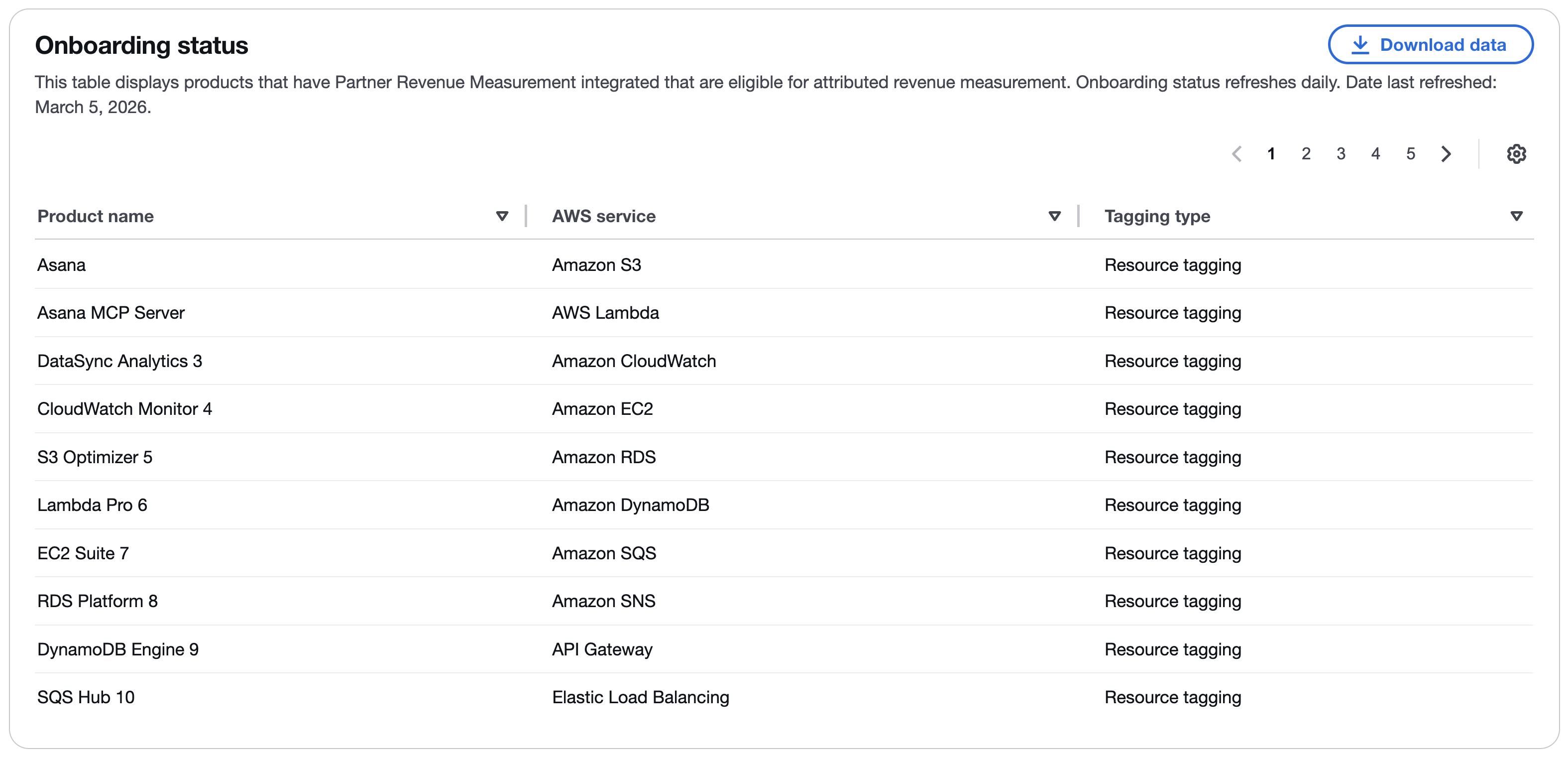
The telemetry feature introduced a new dashboard for partners to monitor attributed revenue. The data included:
- Revenue attributed by product
- Revenue attributed by AWS service
- Telemetry implementation status
Revenue data was visualized across time, offering comparisons between multiple products and services.
User research insights
Usability sessions were conducted with 11 partners using a static comp of the initial dashboard design.
Participants evaluated the clarity of the content and data visualizations. While most feedback focused on feature requests outside the initial scope, one consistent theme surfaced: a preference for bar charts over line charts.
At first glance, this appeared to be a straightforward refinement.
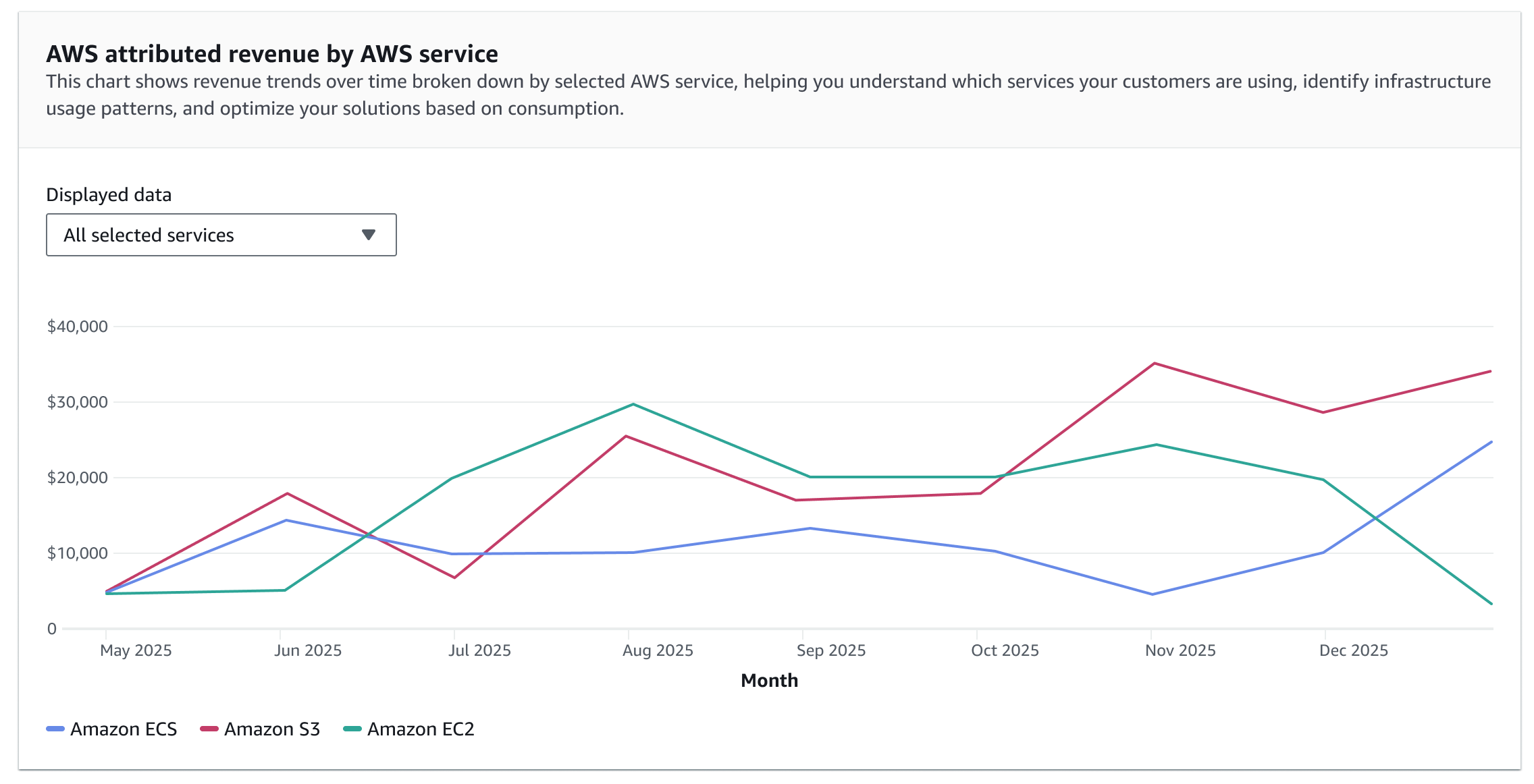
The underlying question became: would a bar chart remain usable at realistic scale?
Testing the feedback at scale
The static research artifact reflected only a limited product set, whereas many partners manage dozens — and sometimes hundreds — of products. To evaluate the bar chart preference responsibly, I needed to visualize the dashboard under expanded product volume.
The challenge became: how could I evaluate that quickly and objectively?
Generating evidence with an AI integrated development environment
To answer that question, I used an AI integrated development environment to generate fully interactive, design-system-compliant prototypes.
Within hours, I recreated the dashboard with expanded product volume, allowing me to:
- Simulate large product sets
- Compare line, bar, and stacked bar charts under high data density
- Preserve production-level interactions, including hover states and tooltips
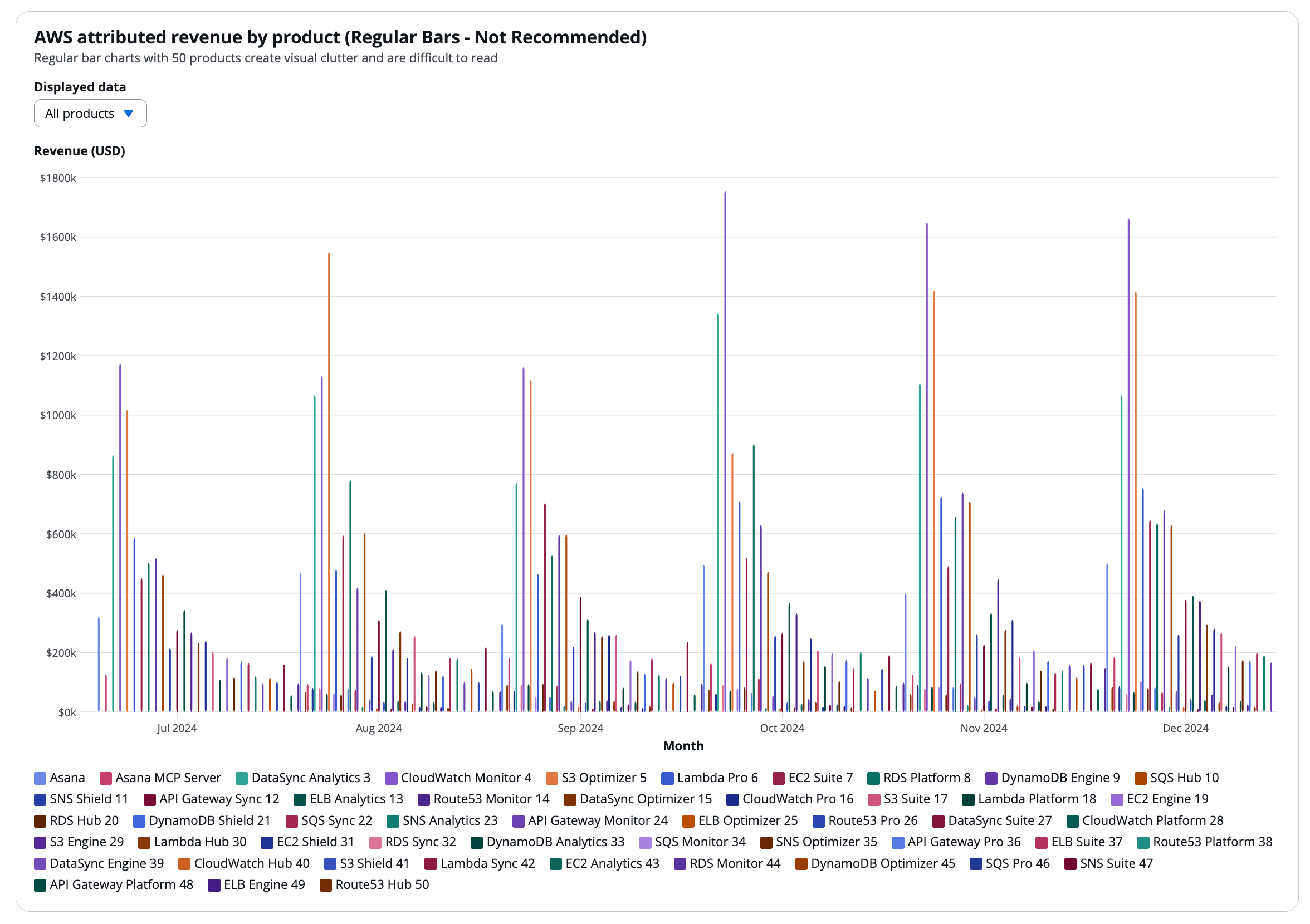
As product counts increased, bars became thin and overlapped, making it difficult to discern trends over time.
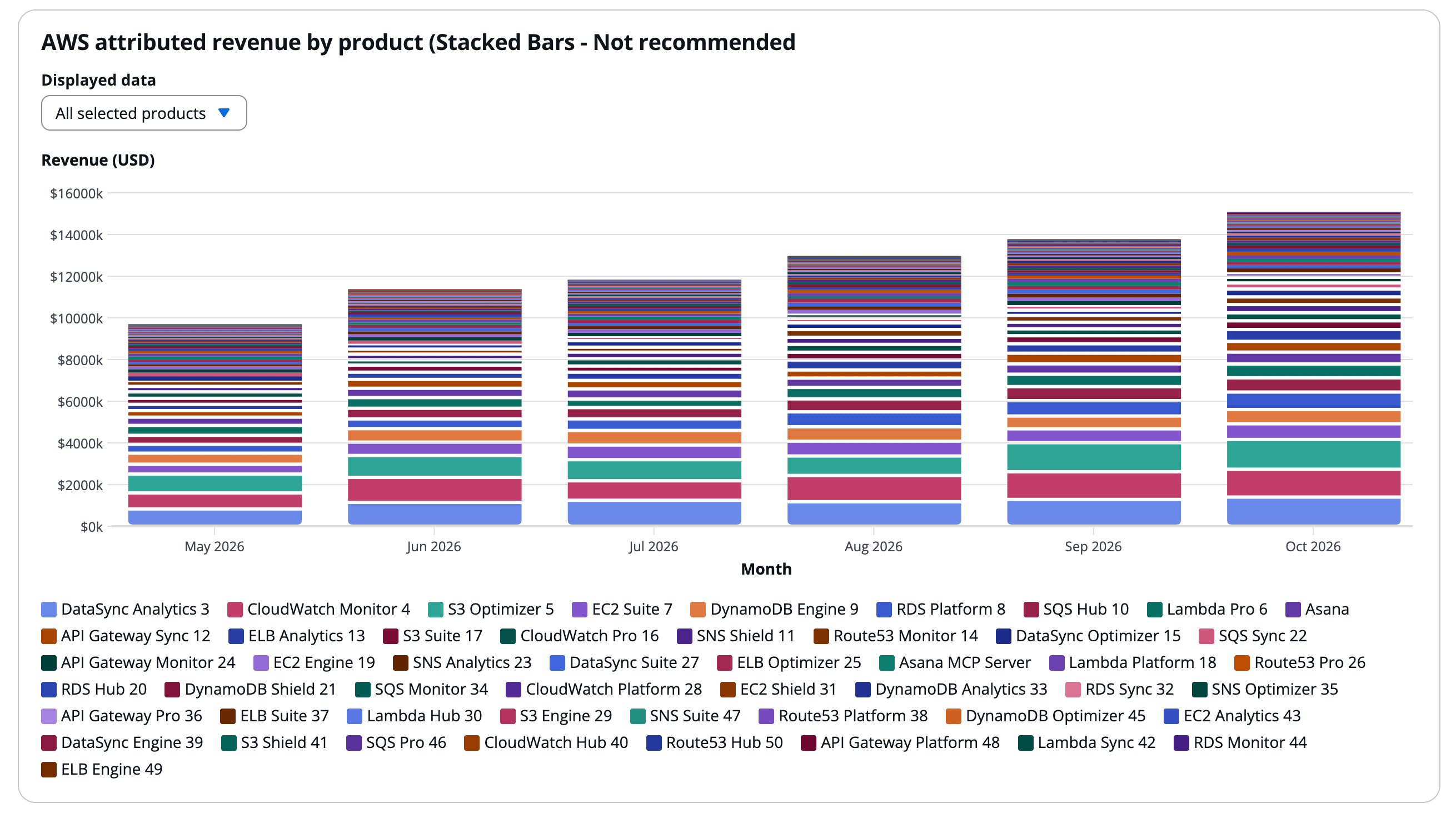
Stacked bars further obscured contribution, compressing individual product signals into dense segments that were difficult to isolate and compare.
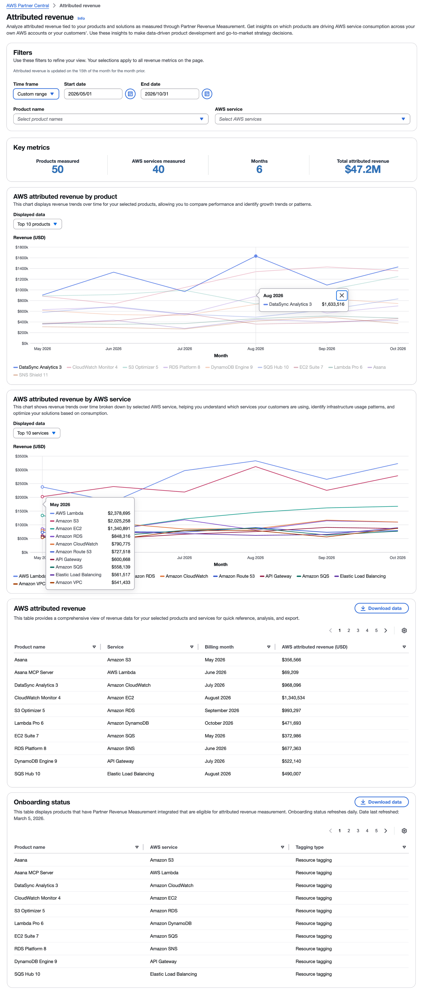
In contrast, the line chart maintained continuity across the full time range. Each product’s color and trajectory extended from month to month, making performance easier to track visually. Unlike bar charts — where gaps between months fragmented the data — continuous lines preserved trend visibility even as the number of products increased.
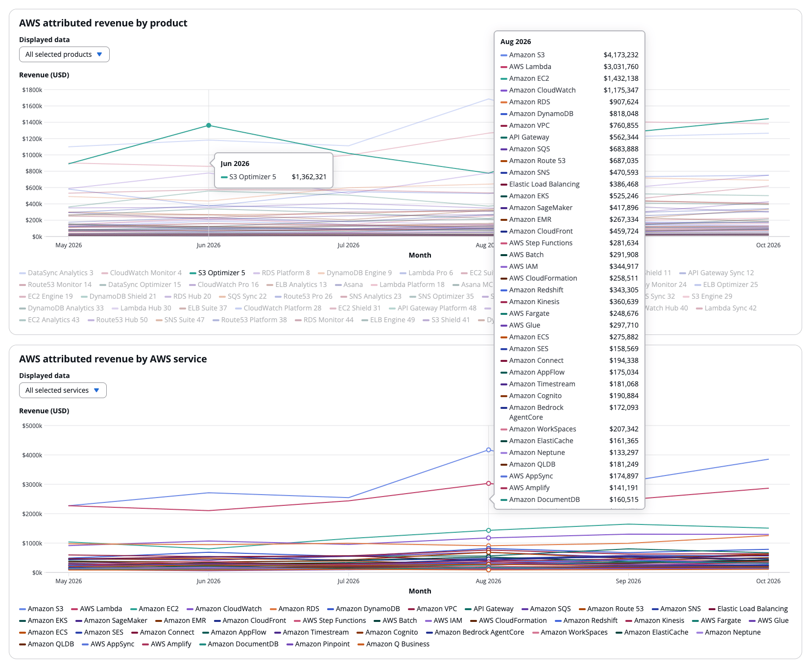
The scalability limitations became immediately apparent. This reframed the decision from preference to measurable performance under realistic data conditions.
Driving alignment through interactive evidence
I allowed stakeholders to experience each chart configuration directly.
I reframed the discussion from “Which chart do we prefer?” to “Which chart continues to work as partners track more products and services over time?”
By grounding the conversation in interactive evidence, I drove alignment quickly and moved the team toward a decision based on how each visualization performed under increased data density.
Final dashboard implementation
With alignment secured, the dashboard was finalized using the line chart as the primary time-series visualization.
What this demonstrates
This project demonstrates my ability to evaluate user feedback critically and validate it against real-world constraints before committing to a direction.
I leverage emerging technology strategically to rapidly generate interactive, production-aligned prototypes that surface risk early and transform subjective preferences into defensible, scalable design decisions.
Return to all projects →
Kristin Standiford
AWS: Scaling partner revenue attribution insights
Using AI-generated prototypes to validate visualization strategy
Snapshot
Role: Senior UX Designer
Context: Amazon Web Services Marketplace and Partner Solutions introduced a telemetry feature that enables partners to see how much revenue their products — and products built on AWS services — generate for the platform. This visibility strengthens partners' ability to co-sell and expand into more customer accounts.
Challenge: Validating user research feedback around data visualization preferences in a way that accounted for real-world product volume — ensuring design decisions would hold up as portfolios scale.
Impact: I drove rapid stakeholder alignment and strengthened decision confidence by generating interactive, design-system-compliant prototypes in an AI integrated development environment. By quickly exposing scalability constraints, I built consensus around rejecting a visualization approach that would not hold up as product catalogs grew.
Product context
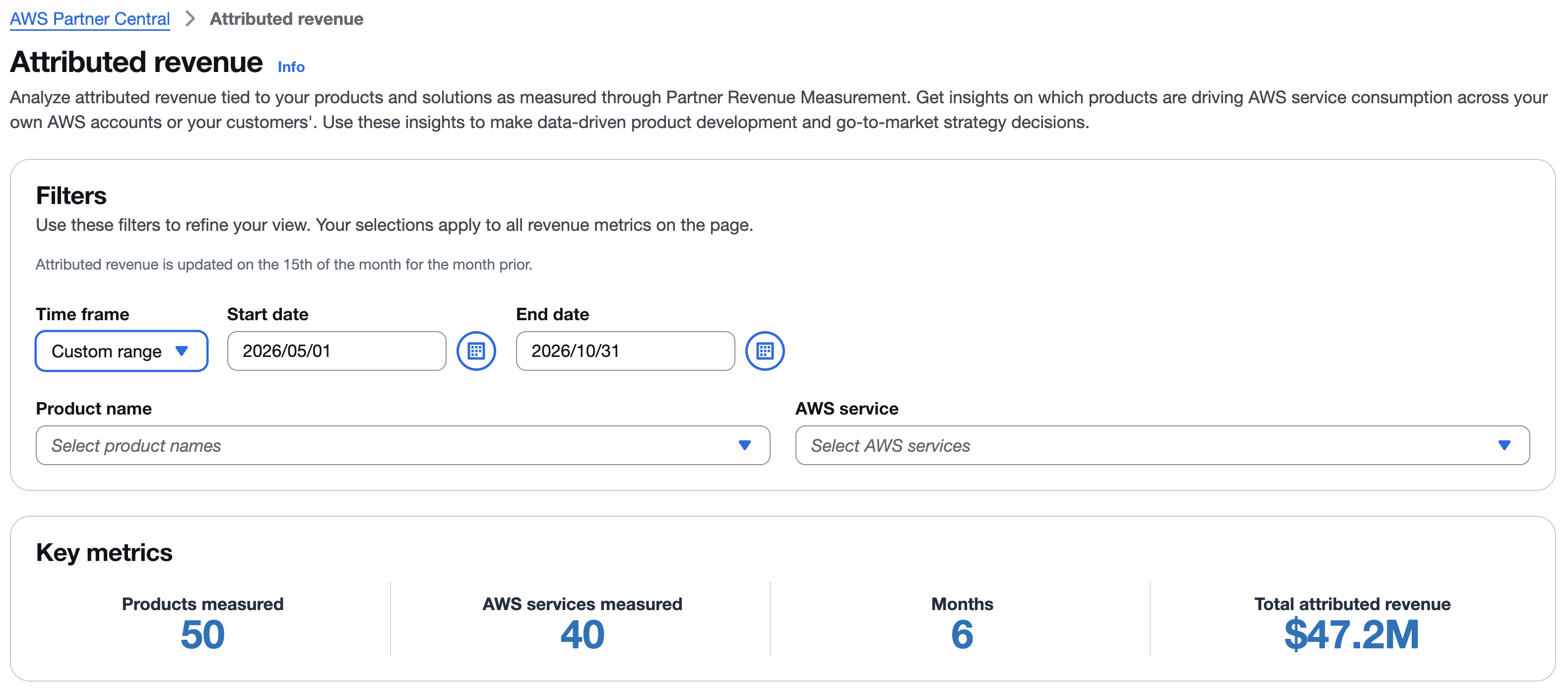
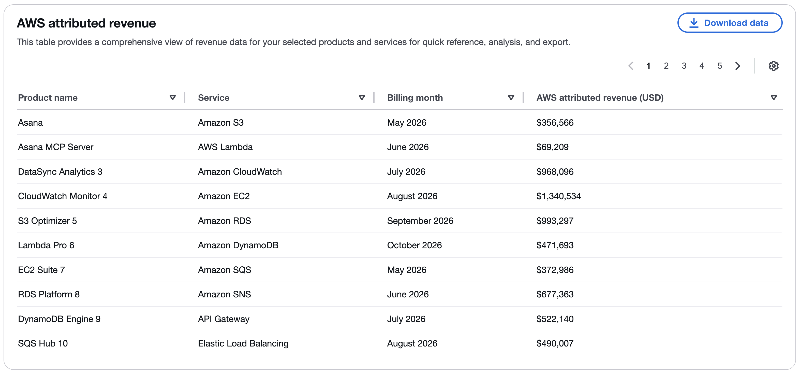
The telemetry feature introduced a new dashboard for partners to monitor attributed revenue. The data included:
- Revenue attributed by product
- Revenue attributed by AWS service
- Telemetry implementation status
Revenue data was visualized across time, offering comparisons between multiple products and services.
User research insights
Usability sessions were conducted with 11 partners using a static comp of the initial dashboard design.
Participants evaluated the clarity of the content and data visualizations. While most feedback focused on feature requests outside the initial scope, one consistent theme surfaced: a preference for bar charts over line charts.
At first glance, this appeared to be a straightforward refinement.
The underlying question became: would a bar chart remain usable at realistic scale?
Testing the feedback at scale
The static research artifact reflected only a limited product set, whereas many partners manage dozens — and sometimes hundreds — of products. To evaluate the bar chart preference responsibly, I needed to visualize the dashboard under expanded product volume.
The challenge became: how could I evaluate that quickly and objectively?
Generating evidence with an AI integrated development environment
To answer that question, I used an AI integrated development environment to generate fully interactive, design-system-compliant prototypes.
Within hours, I recreated the dashboard with expanded product volume, allowing me to:
- Simulate large product sets
- Compare line, bar, and stacked bar charts under high data density
- Preserve production-level interactions, including hover states and tooltips
As product counts increased, bars became thin and overlapped, making it difficult to discern trends over time.
Stacked bars further obscured contribution, compressing individual product signals into dense segments that were difficult to isolate and compare.
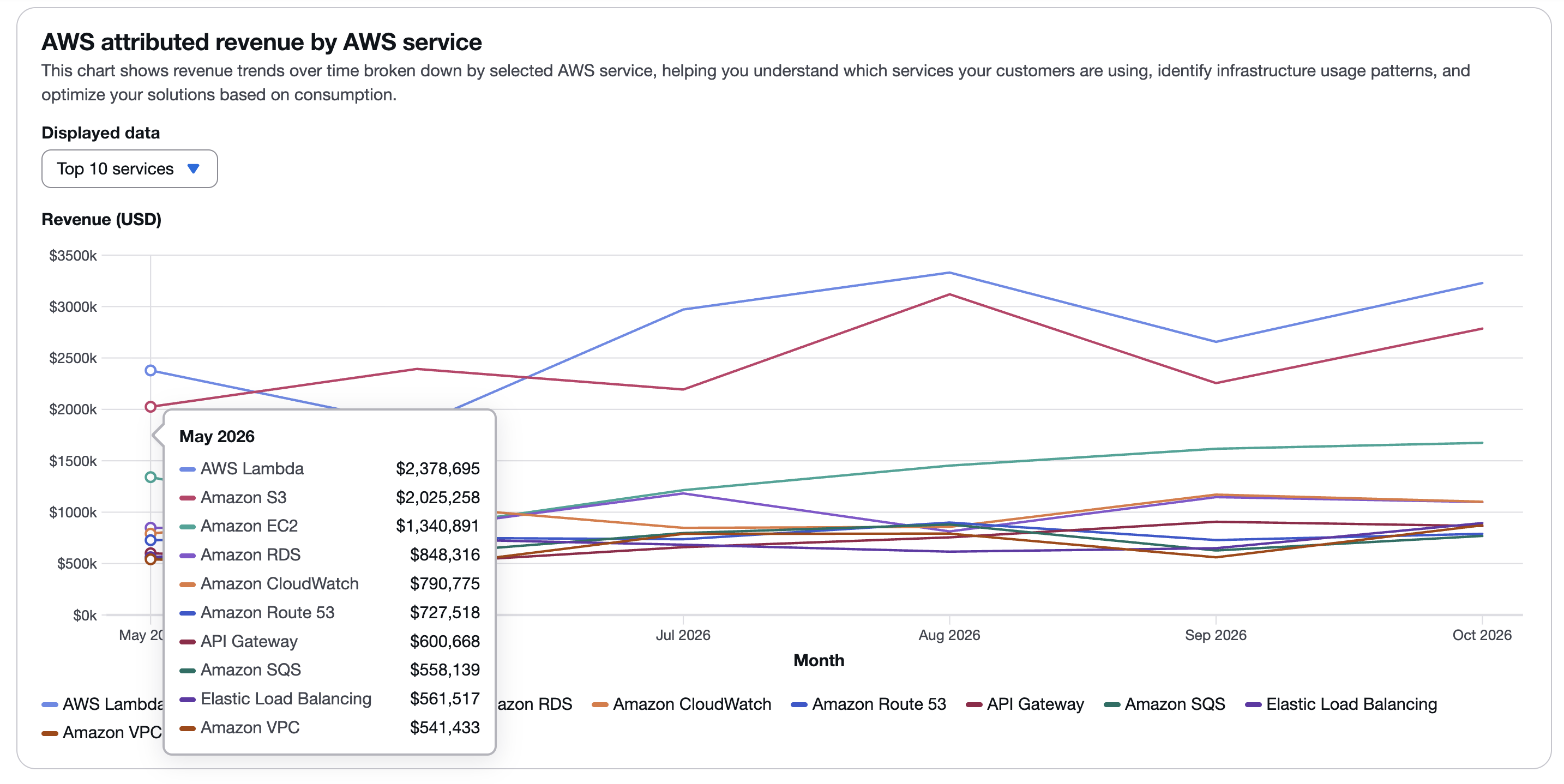
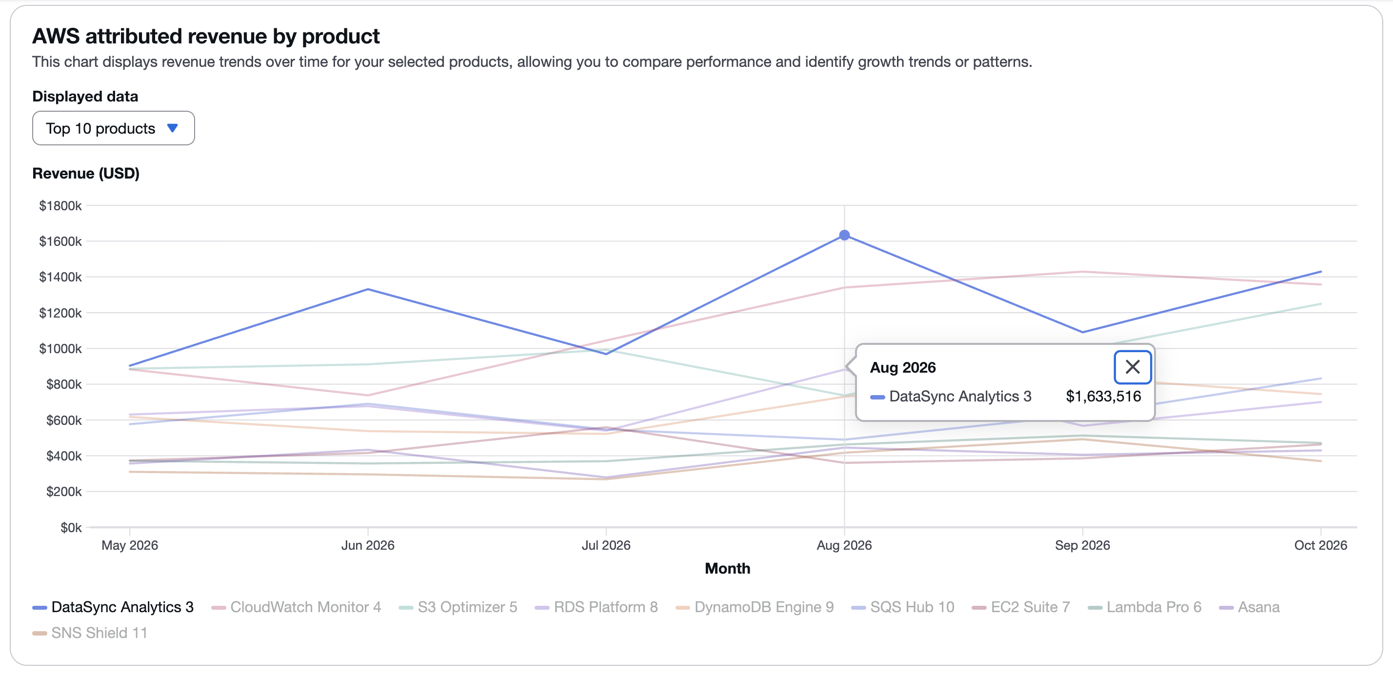
In contrast, the line chart maintained continuity across the full time range. Each product’s color and trajectory extended from month to month, making performance easier to track visually. Unlike bar charts — where gaps between months fragmented the data — continuous lines preserved trend visibility even as the number of products increased.
The scalability limitations became immediately apparent. This reframed the decision from preference to measurable performance under realistic data conditions.
Driving alignment through interactive evidence
I allowed stakeholders to experience each chart configuration directly.
I reframed the discussion from “Which chart do we prefer?” to “Which chart continues to work as partners track more products and services over time?”
By grounding the conversation in interactive evidence, I drove alignment quickly and moved the team toward a decision based on how each visualization performed under increased data density.
Final dashboard implementation
With alignment secured, the dashboard was finalized using the line chart as the primary time-series visualization.
What this demonstrates
This project demonstrates my ability to evaluate user feedback critically and validate it against real-world constraints before committing to a direction.
I leverage emerging technology strategically to rapidly generate interactive, production-aligned prototypes that surface risk early and transform subjective preferences into defensible, scalable design decisions.
Return to all projects →
Kristin Standiford
AWS: Scaling partner revenue attribution insights
Using AI-generated prototypes to validate visualization strategy
Snapshot
Role: Senior UX Designer
Context: Amazon Web Services Marketplace and Partner Solutions introduced a telemetry feature that enables partners to see how much revenue their products — and products built on AWS services — generate for the platform. This visibility strengthens partners' ability to co-sell and expand into more customer accounts.
Challenge: Validating user research feedback around data visualization preferences in a way that accounted for real-world product volume — ensuring design decisions would hold up as portfolios scale.
Impact: I drove rapid stakeholder alignment and strengthened decision confidence by generating interactive, design-system-compliant prototypes in an AI integrated development environment. By quickly exposing scalability constraints, I built consensus around rejecting a visualization approach that would not hold up as product catalogs grew.
Product context
The telemetry feature introduced a new dashboard for partners to monitor attributed revenue. The data included:
- Revenue attributed by product
- Revenue attributed by AWS service
- Telemetry implementation status
Revenue data was visualized across time, offering comparisons between multiple products and services.
User research insights
Usability sessions were conducted with 11 partners using a static comp of the initial dashboard design.
Participants evaluated the clarity of the content and data visualizations. While most feedback focused on feature requests outside the initial scope, one consistent theme surfaced: a preference for bar charts over line charts.
At first glance, this appeared to be a straightforward refinement.
The underlying question became: would a bar chart remain usable at realistic scale?
Testing the feedback at scale
The static research artifact reflected only a limited product set, whereas many partners manage dozens — and sometimes hundreds — of products. To evaluate the bar chart preference responsibly, I needed to visualize the dashboard under expanded product volume.
The challenge became: how could I evaluate that quickly and objectively?
Generating evidence with an AI integrated development environment
To answer that question, I used an AI integrated development environment to generate fully interactive, design-system-compliant prototypes.
Within hours, I recreated the dashboard with expanded product volume, allowing me to:
- Simulate large product sets
- Compare line, bar, and stacked bar charts under high data density
- Preserve production-level interactions, including hover states and tooltips
As product counts increased, bars became thin and overlapped, making it difficult to discern trends over time.
Stacked bars further obscured contribution, compressing individual product signals into dense segments that were difficult to isolate and compare.
In contrast, the line chart maintained continuity across the full time range. Each product’s color and trajectory extended from month to month, making performance easier to track visually. Unlike bar charts — where gaps between months fragmented the data — continuous lines preserved trend visibility even as the number of products increased.
The scalability limitations became immediately apparent. This reframed the decision from preference to measurable performance under realistic data conditions.
Driving alignment through interactive evidence
I allowed stakeholders to experience each chart configuration directly.
I reframed the discussion from “Which chart do we prefer?” to “Which chart continues to work as partners track more products and services over time?”
By grounding the conversation in interactive evidence, I drove alignment quickly and moved the team toward a decision based on how each visualization performed under increased data density.
Final dashboard implementation
With alignment secured, the dashboard was finalized using the line chart as the primary time-series visualization.
What this demonstrates
This project demonstrates my ability to evaluate user feedback critically and validate it against real-world constraints before committing to a direction.
I leverage emerging technology strategically to rapidly generate interactive, production-aligned prototypes that surface risk early and transform subjective preferences into defensible, scalable design decisions.
Return to all projects →